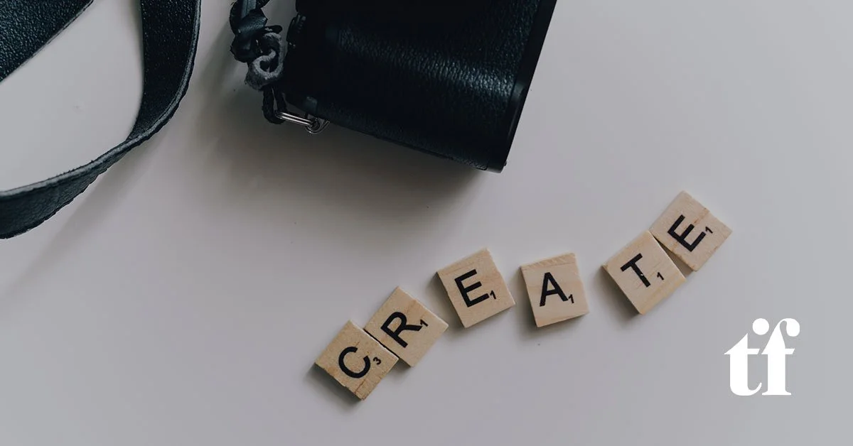
How to Quantify Brand Design
As a Creative Director, I take on every project as if embarking on a diplomatic mission. Many of our clients come from within the financial sector, and without using too broad of a brush, it’s safe to say that most are not creative types.
Making artistic decisions or engaging in the design process can cause some finance executives to opt out in deference, dodge through delegation, or sometimes double down and drive a creative process without knowing how that process is best curated. Meanwhile, the creatives I represent can struggle to prioritize client needs over their aesthetic taste. This communication disconnect can create silos and lead to disappointment on both sides. Branding is a form of creativity — and creativity is art — and it is often judged subjectively, where feelings and opinions matter more than facts. One might think a creative agency would celebrate the level of freedom this communication gap provides — after all, what artist doesn’t want free reign in their expression?
Beauty and Business
It’s important to remember, however, that branding is commercial art meant to serve a purpose, sell a product, advertise a service, etc. These endeavors don’t have the luxury of being purely subjective. The most successful branding projects excel by the metrics of both beauty and business. My role, as the diplomat, is to broker a deal between the goals of bottom-line focused clients and the inclinations of beautiful-is-better indoctrinated designers. So the goal is to make the subjective more objective— and we do so by bringing mutually agreeable facts to the table.
“Design is not just what it looks like and feels like. Design is how it works.” — Steve Jobs
Our approach is to engage our clients in a way that brings them comfort and control. Communication is key, but you can only have clear communication with a common language… that’s why actual diplomats speak through interpreters to ensure nuance is not lost in translation. Our solution is to bring data analysis and creative quantification into our design process — especially on our branding team — for verbal identity endeavors (brand naming) and visual identity endeavors (logo design or evolution). We can then put clients at ease by speaking in a language they’re familiar with.
Our Process
Our first step is to have the client complete a comprehensive project survey. This includes basic information: who they are, what they do, the brand story, etc. But what informs us is the information they share regarding their audience or who they want their audience to be. Relying on research, social media data, and sector-specific information gleaned from our clients, we create an audience profile that includes habits and preferences, as well as trending industry standards. Sharing these data points with our clients allows us to steer the design in a better direction. Data can present facts that we can all agree upon.
Next, we have the clients identify up to a dozen industry peers and guide them through a detailed critique of each of their competitors’ names or logos. For example, when exploring a logo evolution, we encourage clients to pick apart each competitive design, looking at all the elements separately: typeface (font), capitalization, color, layout, and the marque (symbol). As we dissect these logos, our clients start to wield their newfound vocabulary like old pros.
“This one’s a sans-serif slab font in title caps.”
“The color contrast is too stark. We want something softer.”
It’s enough to make a diplomat cry. [grin]
We continue to bridge the creative/corporate divide by helping these new art critics understand what they do and don’t like using a simple rating system for each piece of the competitors’ logos. Every aspect is given a rating on a 0-to-10 (hate-to-love) scale. This helps transform feelings into data and enables us to quantify subtle differences in collective preferences. All this information is summarized with a peer audit, which paints a clear picture of any branding trends in their industry. For example, they may see that 80% of their competitors use the color blue, 60% use a serif typeface, and 90% include an icon or brand marque.
Once the data is assembled, we ask the client to consider the design development objective in the following terms:
How important is it to you that your brand is perceived as a part of the sector, equal to or better than your peers/competitors?
How important is it to you that your brand differentiates you from your competitors?
If the current identity starts at zero, what percentage do you want to evolve your logo?
The Results
We have found that looking at design from a quantifiable perspective is a source of comfort for those who are used to assessing ROI. The mutually agreed-upon facts allow all parties to be objective when evaluating the creative. While this quant-forward approach requires a heavy pre-production lift from our branding team, having a detailed data profile to work from helps to level-set the design process so that the client and the designer are immediately on the same page. The front-loaded investment pays off as a shortcut to the result more efficiently once production starts.
In the end, most designers feel more comfortable in their world of aesthetics and emotional response, while their business-centric counterparts may not stray from their world of numbers. In my job as a design diplomat, I think we’ve found an effective way to bring everyone to the table. By embedding data analysis into an otherwise subjective process, we knock down the existing communication silos and deliver a better result. When we make the creative process accessible to business leaders through quantification, they can appreciate the value of creating a smart and beautiful logo.
Feeling inspired? Reach out and say [email protected].